 Swiftlisted
Choosing the Cover Photo That Gets the Click
If your listings get few views, the first photo is the most likely culprit. It is the only image a browsing buyer sees in the grid, so it has to do the work of the whole listing in less than a second. The fix is rarely a better camera. It is choosing the right shot, framing it for a thumbnail, and testing it honestly against the other items around it. Below is a method you can apply to your next batch today, along with the trade-offs and the things that can still go wrong.
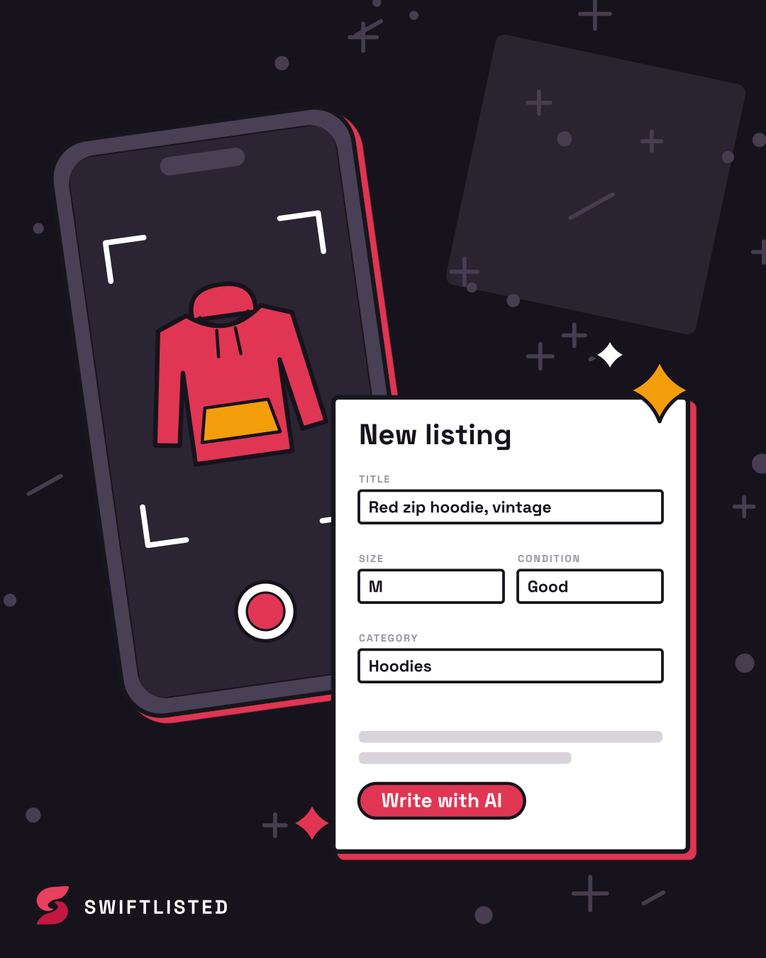
What the buyer actually sees
Most marketplace feeds show a small square or near-square thumbnail, often next to a dozen other items. The buyer is not reading your title or price at this stage; they are deciding in a fraction of a second whether the item is worth a tap. That means the cover photo needs to be readable at small size, and it needs to show the item clearly enough that the buyer knows what it is without any help.
Your cover photo is not the same as your gallery. Buyers who open the listing will see the rest of your photos, but the cover is the only one that earns the open. Treat it as a separate job.
- Assume the thumbnail is small. If details disappear when you shrink the image, they will not register.
- Assume the buyer scrolls fast. The item must read as a single, clear subject.
- Assume the cover competes with other sellers in the same search results.
A method for choosing the cover
Start by taking or selecting three to five candidate photos per item rather than the first one you happened to shoot. Then shrink each one to roughly thumbnail size on your screen and look at it from a normal distance. Ask which one tells you what the item is, what colour it is, and roughly what state it is in, without squinting.
Next, check the background and lighting. A plain, evenly lit background usually beats a busy one, because a cluttered backdrop pulls the eye away from the garment or object. Natural daylight from a window tends to give truer colour than overhead room lighting, which can shift blues and greys. Avoid shots where the item is in shadow or where a reflection from a phone or a window sits across it.
Finally, confirm the cover shows the item's most saleable feature. For clothing that is usually the front view with the full silhouette visible. For a bag it may be the front with the hardware clearly in frame. Keep the shot straight-on and fill most of the frame with the item, rather than leaving large empty margins that shrink it to a speck in the grid.
- Pick three to five candidates and compare them at thumbnail size.
- Prefer a plain, even background over a busy one.
- Use daylight where you can; check colour against the real item.
- Fill the frame with the item and keep the angle straight-on.
- Avoid glare, deep shadow and reflections across the main subject.
Worked example: a jacket and a pair of trainers
Consider a navy wool coat. The first photo you shot shows it draped over a chair in a dim room, with the collar folded under. At thumbnail size it looks like a dark, shapeless blur. A better candidate is the same coat laid flat on a light wall in daylight, buttoned, with the full length visible. The colour reads as navy rather than black, and the cut is obvious. That second photo is almost certainly the stronger cover.
Now take a pair of white trainers. Shot from above on a messy floor, the shoes are small and the background competes with them. Shot from a 45-degree angle on a plain sheet, with both shoes side by side and the sole visible, they read as a clear product. The lesson is the same in both cases: the cover that wins is usually the one that makes the item easiest to identify in the smallest possible size.
Keep a note of which cover style works for each category you sell. You will often find that one approach suits a whole category, which saves time on the next batch.
- Test the strongest candidate in a real search result alongside competitors.
- Keep notes on which framing works for each category you sell.
Testing honestly, and what can go wrong
Changing a cover photo is not a guaranteed fix. Marketplace search and feed ranking depend on factors you do not control: price, category, seller history, how recently the listing was posted and how many similar items exist. A better cover can improve click-through on an item that is already visible, but it cannot make a listing appear in results it is not ranking in. Judge changes over a reasonable period rather than a single afternoon, and change one thing at a time so you know what helped.
Be careful with editing. Heavy colour correction, filters or cropping that hides the item's true condition can produce complaints, returns or disputes, and a cover that misrepresents the item is a bad trade even if it gets more clicks. Show flaws honestly in the gallery, and keep the cover true to the piece.
Swiftlisted can help with the parts of this that are repetitive. It can group your photos into items, draft the listing fields and, where you use the background removal tool, produce a plainer backdrop. Read the draft before it posts: an AI-generated title or size can be wrong, and a photo that looks right can still belong to the wrong item if grouping was off. Nothing is posted until you choose to list it, and you can correct any grouping by hand. The AI is a first draft, not a finished listing. Also remember that marketplaces set their own rules and change them, so check each marketplace's current policy on photos and editing before you rely on any particular approach.
- Change one thing at a time so you can tell what helped.
- Give cover changes a reasonable window before judging them.
- Keep the cover true to the item; show flaws in the gallery.
- Check every AI draft and photo grouping before listing.
- Check each marketplace's current photo and editing policy.
Common questions
- Does a better cover photo always get more views?
- No. Ranking depends on price, category, seller history, listing age and competition as well as the photo. A stronger cover improves the chance a visible listing gets tapped, but it will not fix a listing that is not appearing in results.
- Should I use the front or the back of an item as the cover?
- Usually the front, because it shows the silhouette or the design most clearly. Use the back or a detail shot as a gallery image, unless the back carries a feature buyers search for, such as a distinctive label or print.
- Is it fine to remove the background from my cover photo?
- A plain background often helps the item stand out, and background removal is one way to get that. Make sure the edited image still shows the item accurately, and check each marketplace's current policy on edited photos.
- How many photos should I use per listing?
- Use enough to show the front, back, labels and any flaws. The cover is what gets the click, but the gallery is what turns a click into a purchase, so do not skimp on it.
List once, sell everywhere
Swiftlisted photographs, describes and crosslists your stock across every marketplace you sell on — then delists it everywhere when it sells.
Start free trial